In these projects I either pursued an interesting line of inquiry or devised a tool I thought would be useful. They were built with R, Python, MySQL, Excel VBA, Javascript, jQuery, or some combination of them, and skills learned in courses taken on the edX or Coursera platforms.
Data analysis, exploration, and visualization
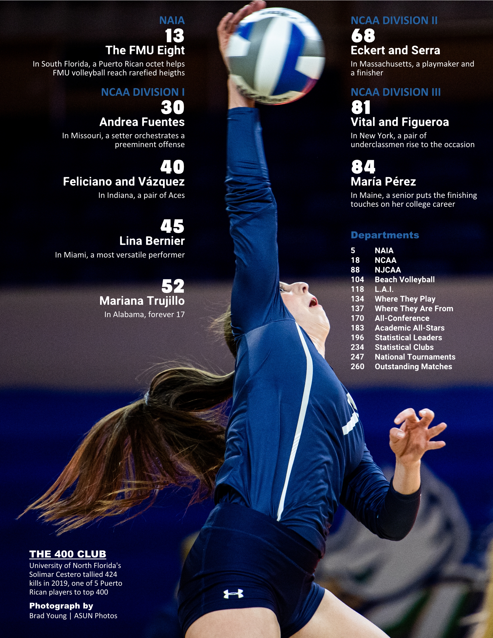
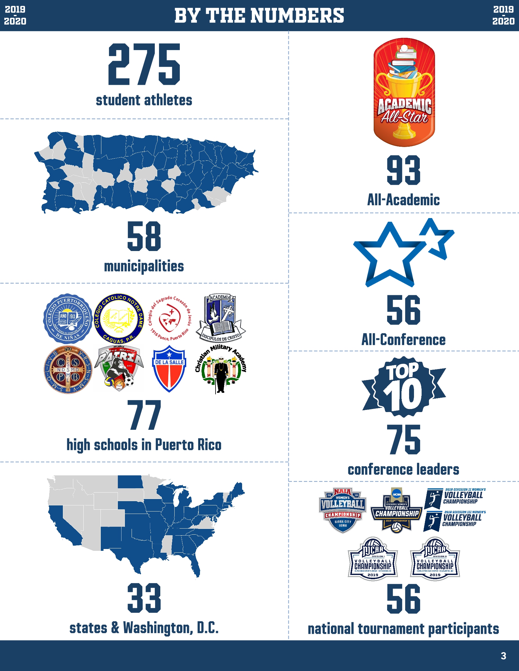
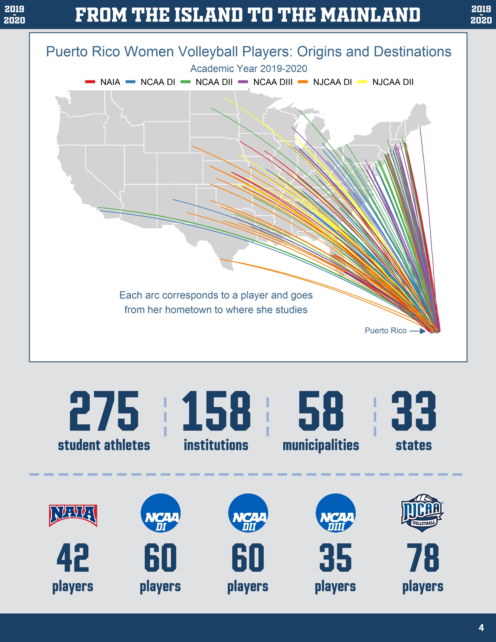
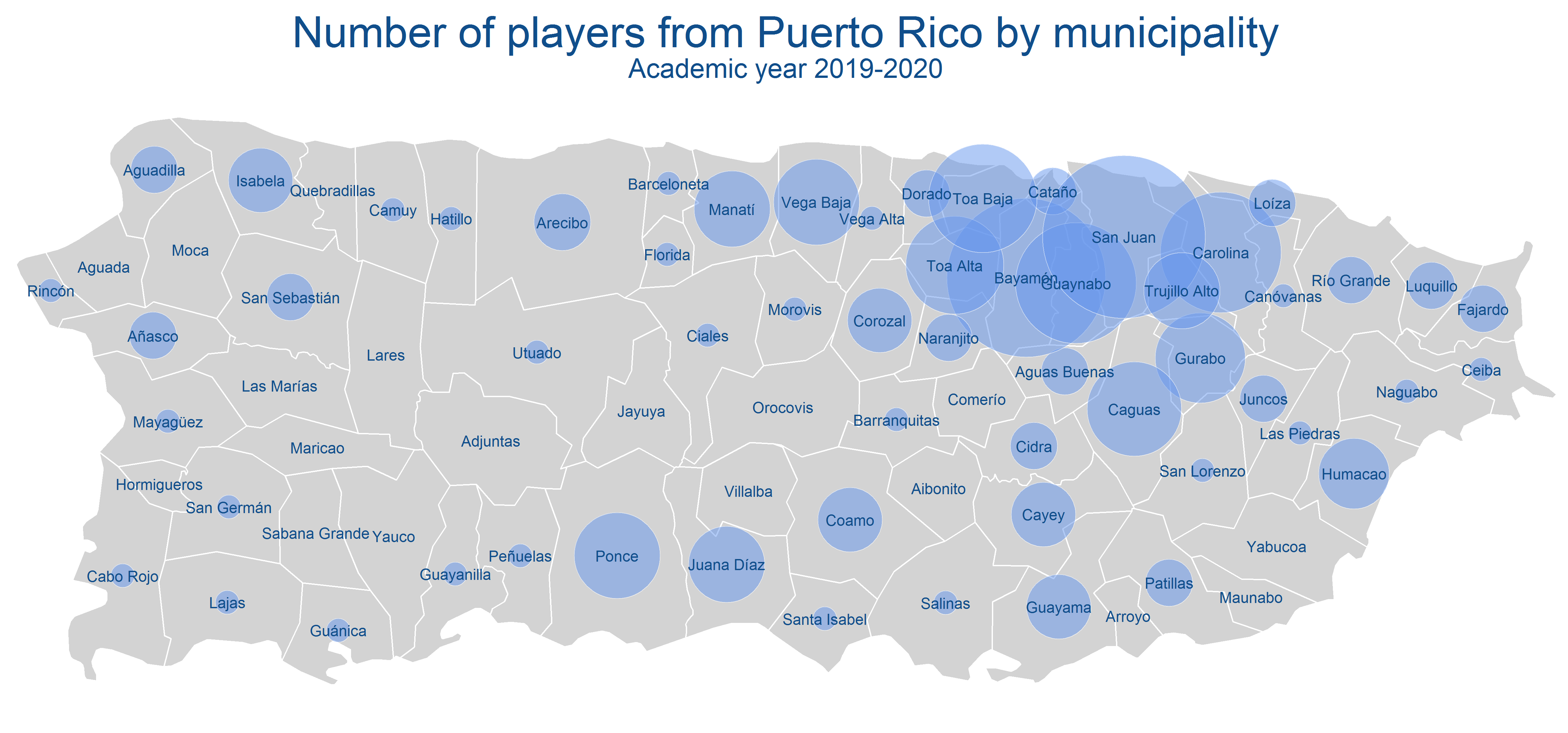
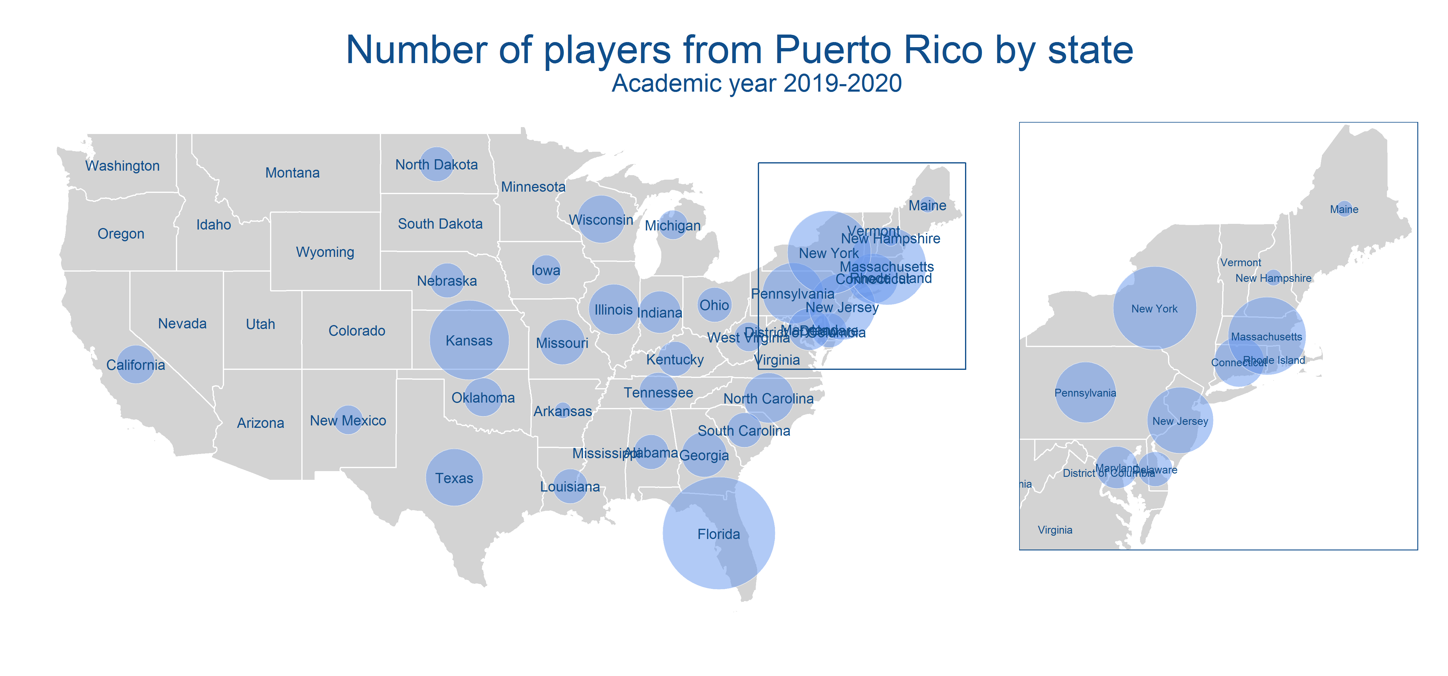
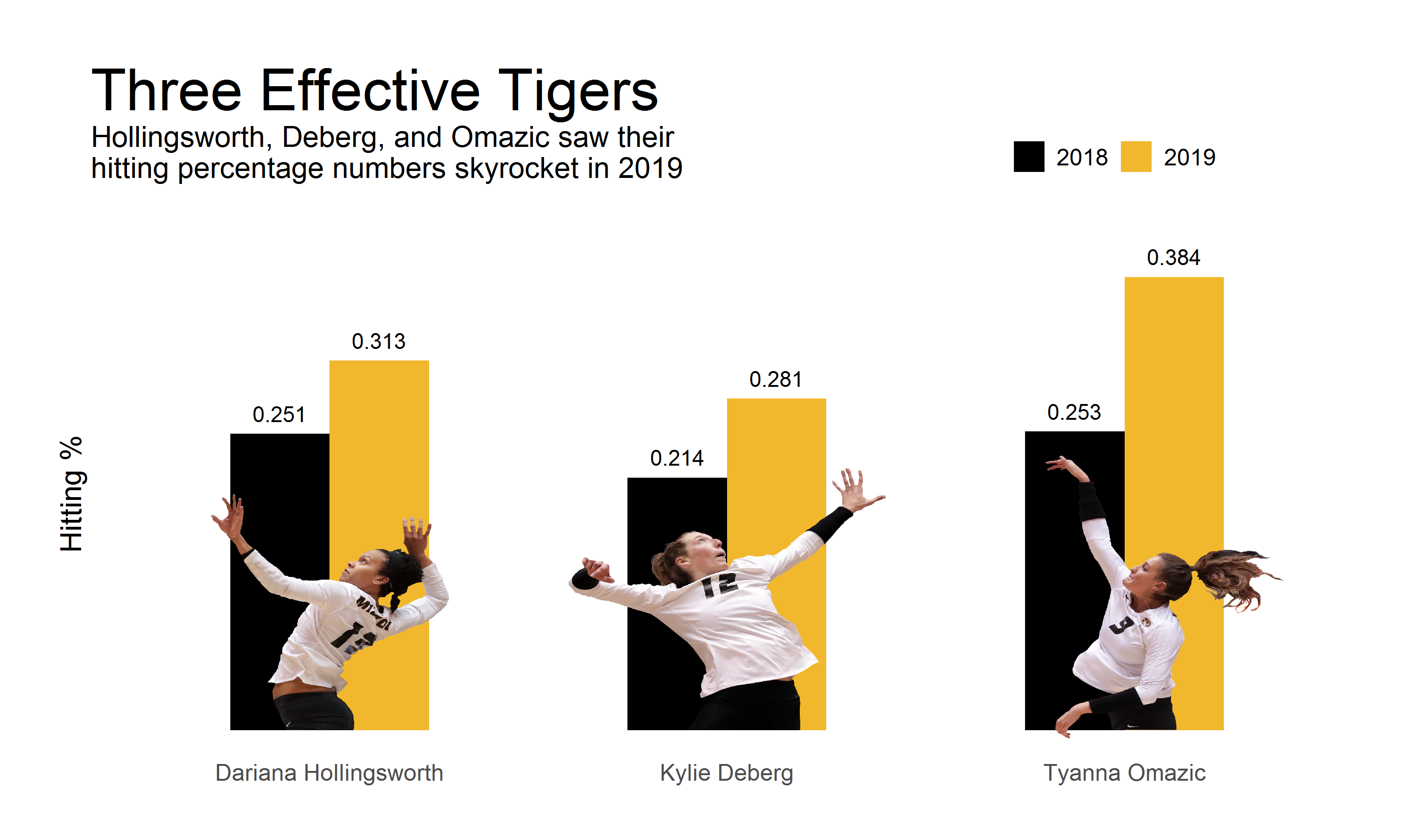
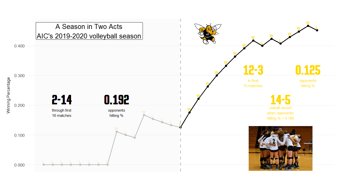
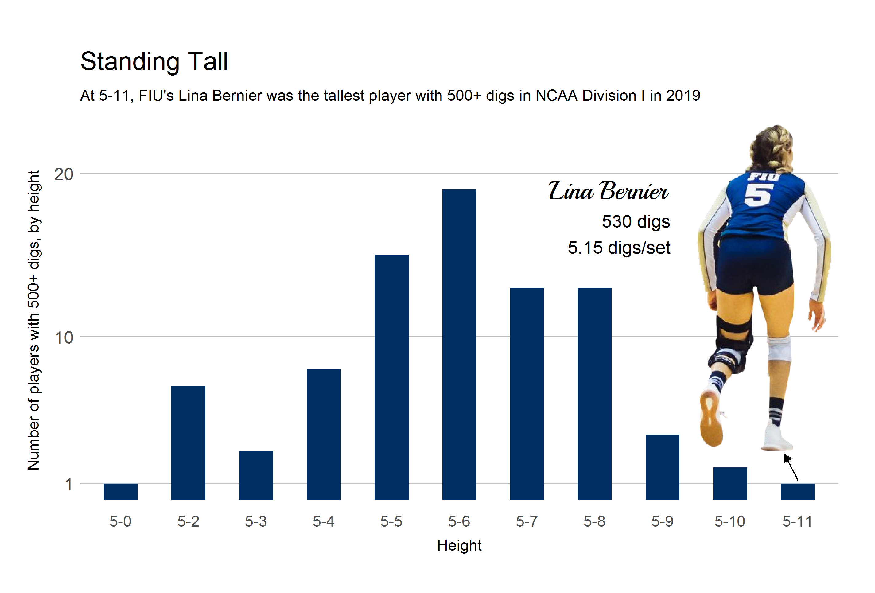
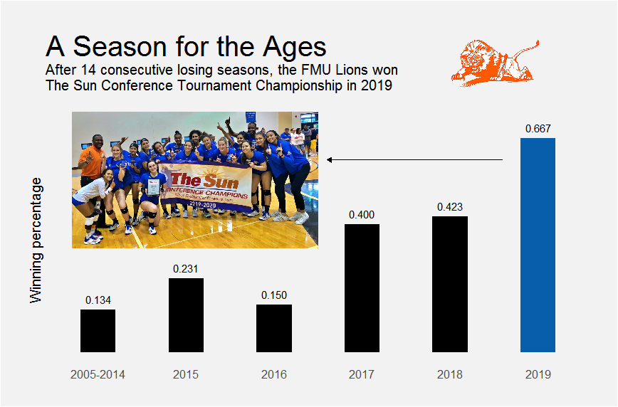
Boricuas in the NCAA: 2019-2020 yearbook of Puerto Rico women’s college volleyball in the U.S.A.
Inspired by the SI yearbooks for college and pro sports, the project documents the performance of Puerto Rico’s college volleyball players throughout the United States. Maps were created using R, while the document itself, to a vast extent, was created using the Python API for Scribus, a desktop publishing software.

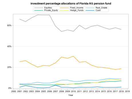
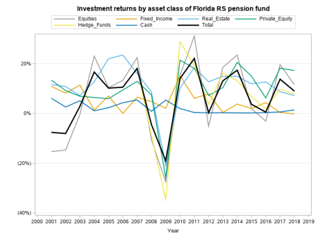
Tracking the performance of the Florida Retirement System pension fund 
This notebook uses SAS and PROC SQL to visualize the performance of the Florida Retirement System pension fund, one of the largest in the United States. The data is from the Center for Retirement Research at Boston College, which tracks 180 pension funds across the United States. The performance of the fund is also compared to those of other large funds.
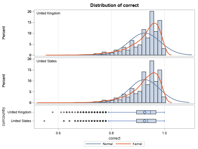
Comparing the grammatical proficiency of ESL learners in English-speaking countries
This notebook uses SAS to compare the grammatical proficiency of English learners in the United States to that of learners in other countries of the Anglosphere. The dataset came from three Boston-area professors who collected and analyzed data from more than 600,000 people who took an online English grammar quiz.
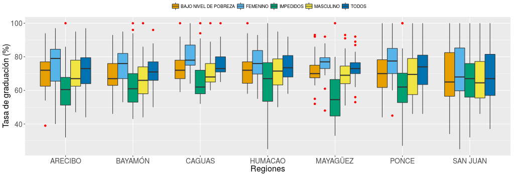
Interactive visualization of performance of Puerto Rican high schools in 2013-2014
Interactive visualization of the graduation rates of all public high schools in Puerto Rico, across regions, districts, and cities, using R and Shiny server.
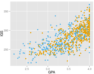
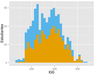
Interactive visualization of 5 years of University of Puerto Rico admissions data
An interactive web app created using ~69,000 records from Puerto Rico’s Open Data Portal, corresponding to students admitted to the UPR campuses over a 5-year period, using R and Shiny server. The app helps educators and future applicants visualize the qualifications of students admitted to a given UPR campus in a given year. The app also illustrates the most popular majors among male and female students, as well as the most selective ones overall. In addition, the most frequent high schools of provenance of those admitted to a campus and the top performing schools in Puerto Rico are also graphed.
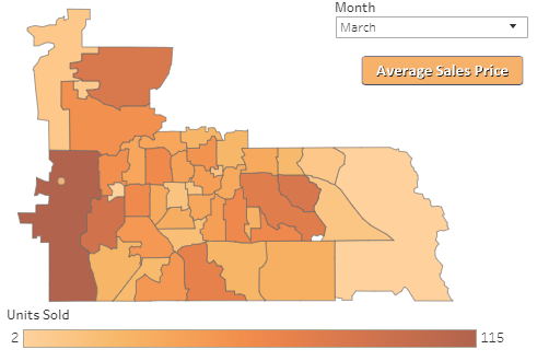
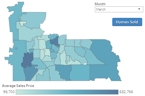
Orange County Real Estate Sales By Zipcode
Tableau visualization of Orlando real estate sales by zipcode, using data provided by the Orlando Regional Realtor Association.
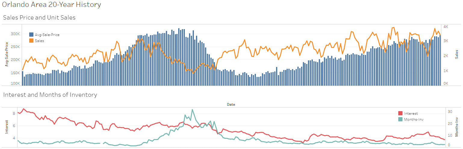
Orlando Real Estate 20-Year History
Tableau visualization of 20 years of Orlando real estate sales, using data provided by the Orlando Regional Realtor Association.
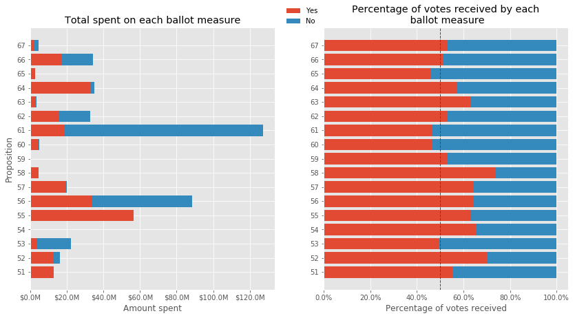
Analysis of 2016 California ballot measures
This is the final project for Python for Data Journalists: Analyzing Money in Politics, a course offered by the Knight Center for Journalism in the Americas. The project summarizes and plots the sources and amount of funding received by the various ballot measures from the November 8, 2016 election in California, as well as the voting results, using Python, Jupyter, pandas, numpy, and matplotlib.
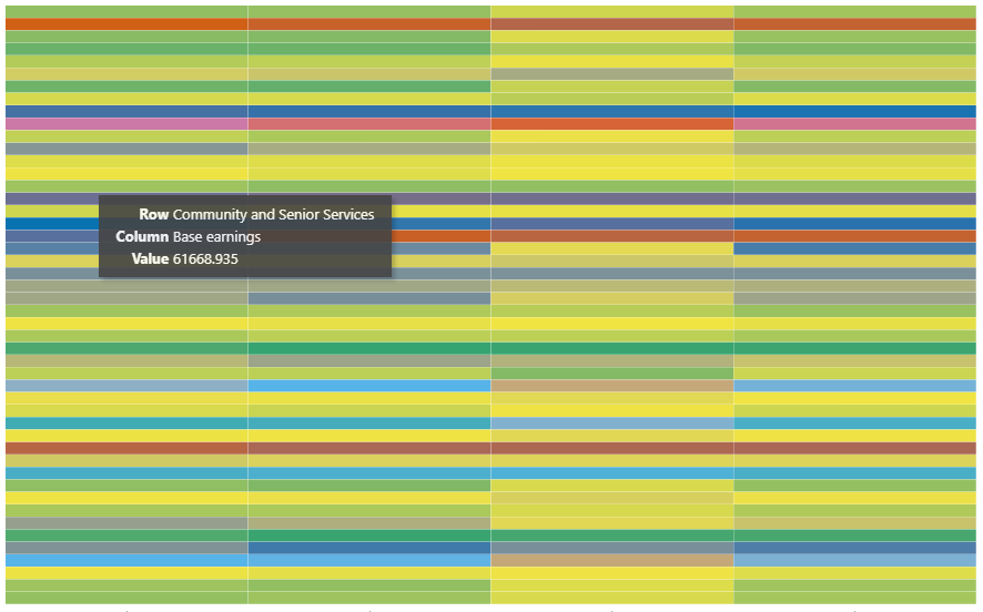
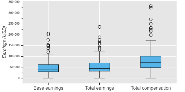
Los Angeles County salaries dashboard (2013-2015, 300,000 records)
Heatmaps and boxplots dashboard for an L.A. County employee salaries dataset that includes employees’ salaries and benefits for the years 2013-2015, using R, the rbokeh package, and Shiny server.
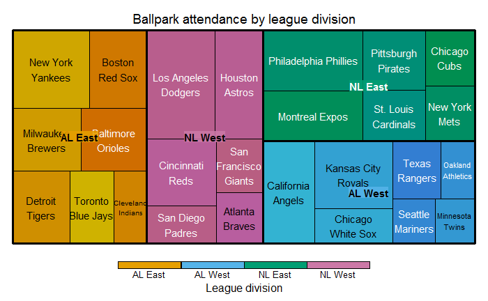
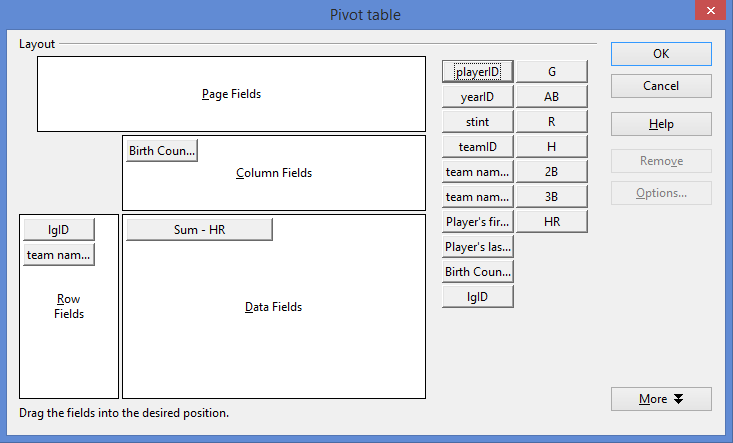
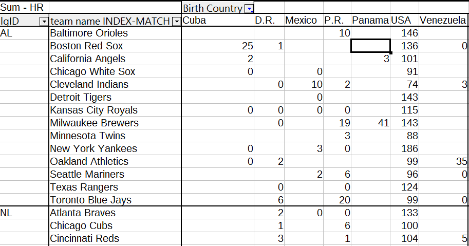
Exploring the 1980 MLB season with MySQL and R
A whimsical look at the 1980 Major League Baseball season using MySQL, R, and the 2016 Lahman database, which has baseball data going back to 1871. In 1980, baseball was a big deal.
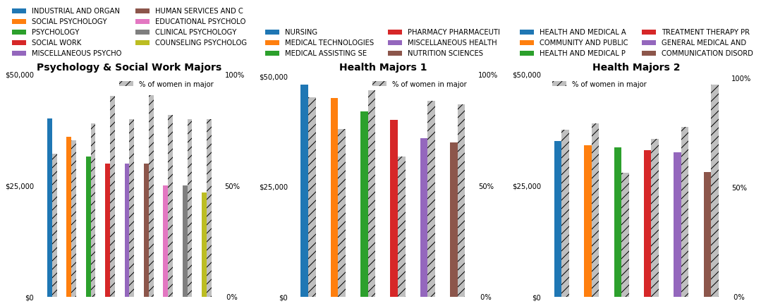
Majors, salaries, and genders
A visualization of the median salaries of recent graduates of about 170 majors, and the degree of women’s participation in each major, using Python, Jupyter, pandas, numpy, and matplotlib.
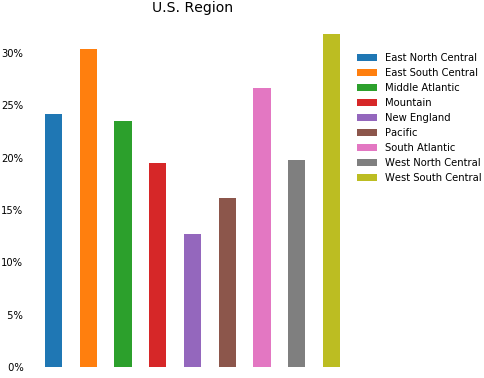
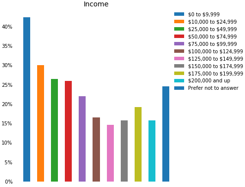
Who shops Black Friday sales on Thanksgiving Day?
An exploration and visualization of who shops the Black Friday sales on Thanksgiving Day, using Python, Jupyter, pandas, numpy, and matplotlib.
Lookup tables and pivot tables in spreadsheets (and R)
What lookup functions and pivot tables in spreadsheets can do for us and their equivalents in R, using R notebook, Excel, MySQL (RMySQL), and XAMPP.
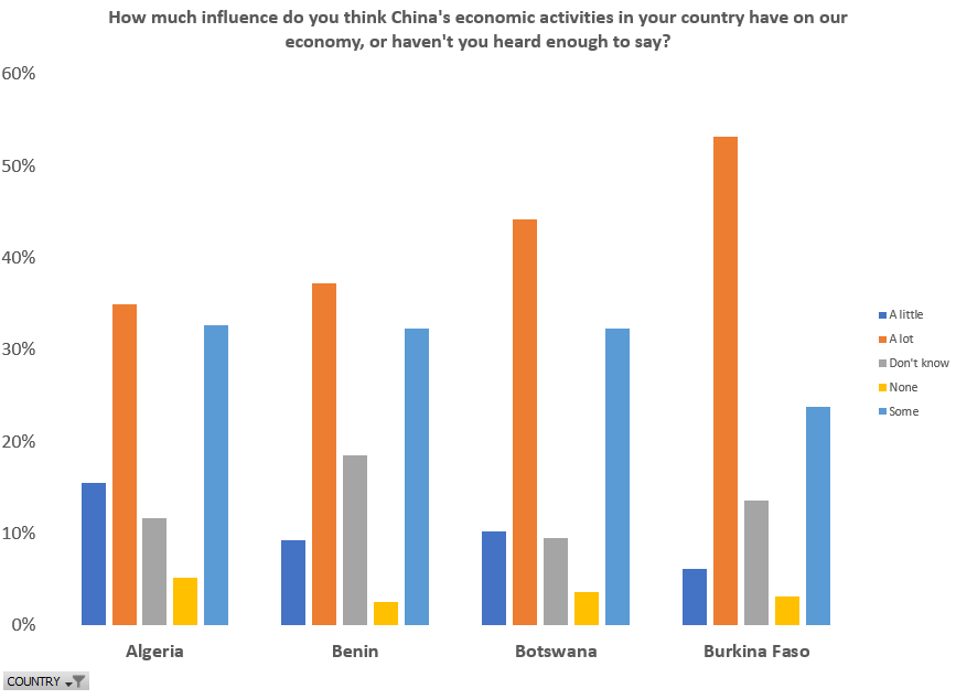
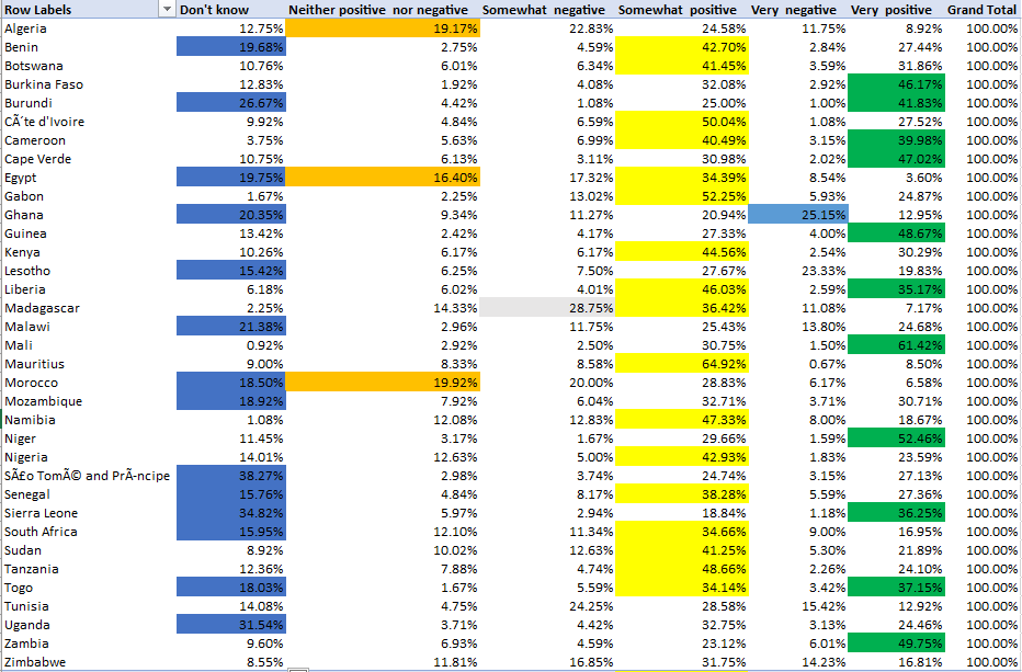
Exploring Africans’ views on China using Excel VBA
Using Afrobarometer’s 2016 poll data and Excel VBA to gain some insight into Africans’ view on China.
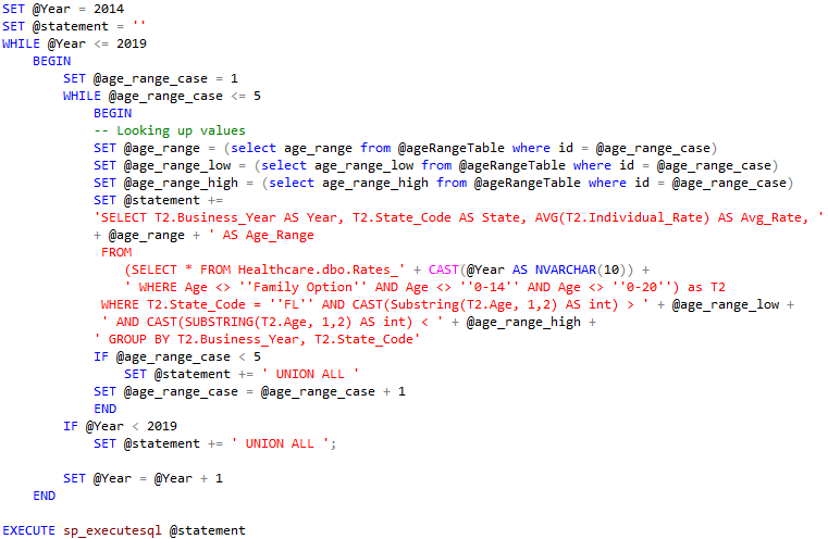
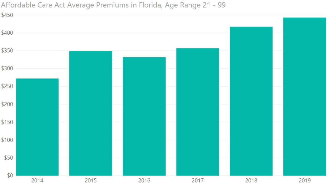
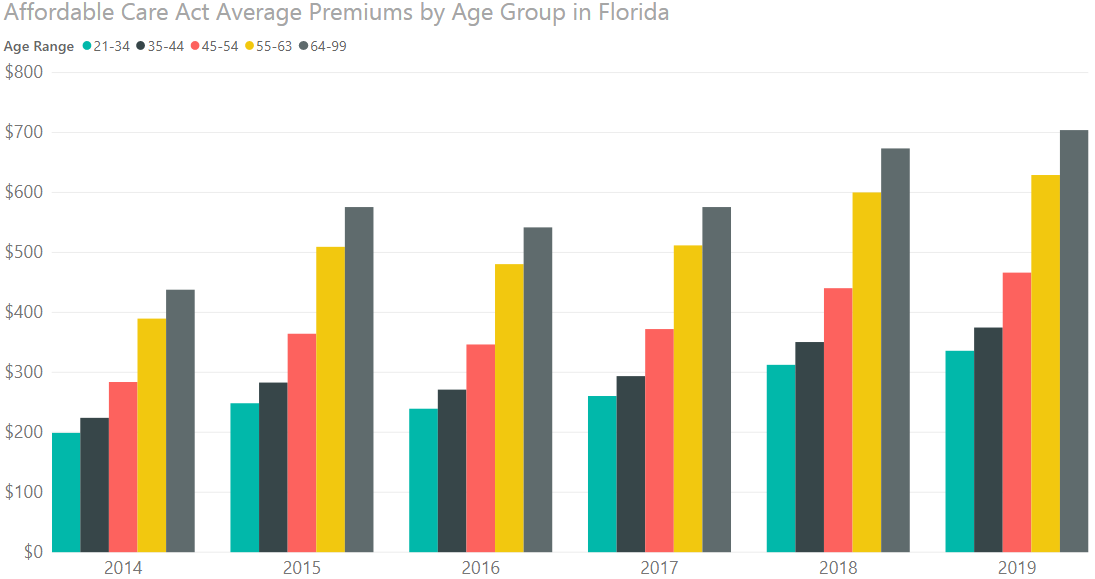
Exploring the rising costs of the Affordable Care Act’s insurance premiums in Florida
Used Microsoft SQL Server, Power BI, and R to explore and visualize insurance premium data from 2014 to 2019 downloaded from Healthcare.gov’s data website. A SQL Server was set up and Transact SQL queries were run against it to extract the relevant data, which was then visualized using Power BI and R.
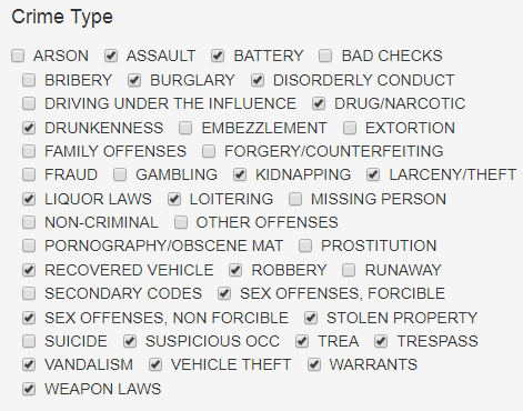
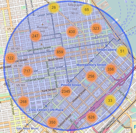
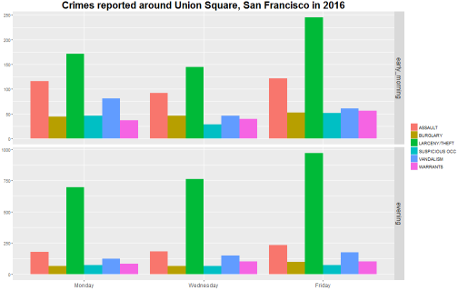
Crime maps
These interactive maps plot police activity within a given radius of a location. The user can specify types of incidents, days of week, and times of day to refine results. Each of them also displays density maps, faceted bar plots, and contingency tables. They were put together using using R and Shiny server, while the data was pre-processed using Python.
- Orlando police calls map (2009-2015, 3 million records)
- Puerto Rico crime map (2012-2015, 220,000 records)
- Los Angeles crime map (2004-2015, 2 million records)
- Chicago crime map (2001-2016, 14 million records)
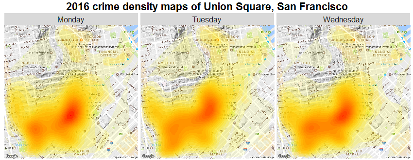
- San Francisco crime map (2003-2016, 2 million records)
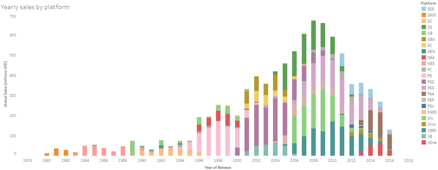
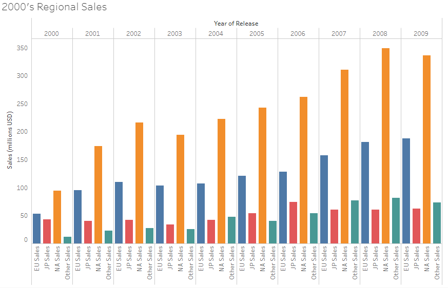
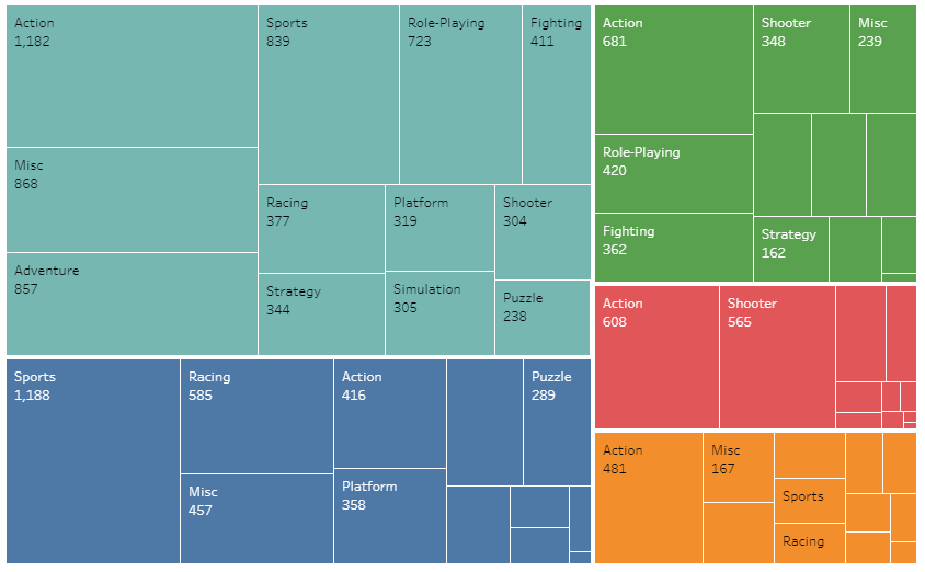
Video game sales by year, platform, genre, and region
Tableau visualization of this Kaggle dataset that includes video game sales of some 16,000 video released between the 1980’s and 2016.
Data pre-processing
Pre-processing of police calls data
This notebook describes the pre-processing, using R notebook, applied to a dataset that would eventually be used in the Orlando police calls map.
Statistical inference
These statistical inference projects were done using R notebook.
Inference on a population mean
An R notebook that infers the true average number of hours worked by Americans, based on the 2016 General Social Survey.
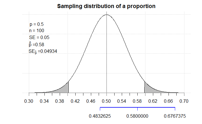
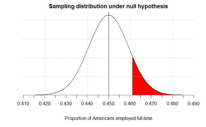
Inference on a population proportion
An R notebook that infers the true proportion of Americans working full time, based on the 2016 General Social Survey.
Inference on the difference in population means
An R notebook that infers the true difference in mean self-ranking between two populations: Americans who voted for Mitt Romney in the 2012 presidential elections, and those who voted for Barack Obama.
Inference on the difference in population proportions
An R notebook that makes inferences about the true difference in proportion of gun ownership between two populations: Americans who don’t live within a 1-mile radius of an area they fear, and Americans who do.
Machine learning
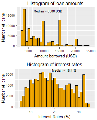
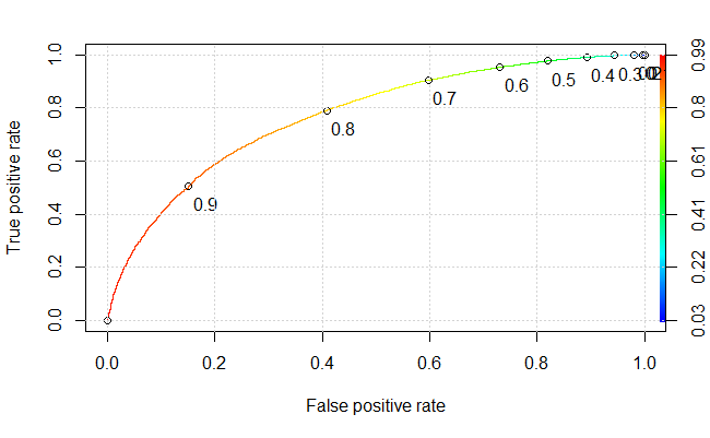
Notebook: Predicting the performance of Prosper loans using logistic regression
Devising a strategy to invest in Prosper loans using logistic regression, R notebook, and the caret and ROCR packages.
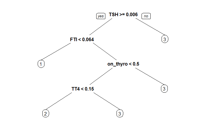
Notebook: Predicting thyroid diagnoses with decision trees using R notebook and the rpart package
Notebook: Predicting the severity of mammography assessments with decision trees using R notebook and the rpart package
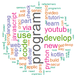
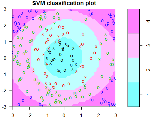
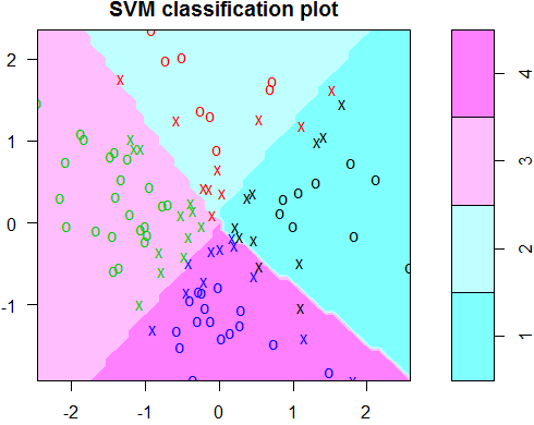
Notebook: Classification of tweets using SVM
Visualizing and classifying tweets using Support Vector Machines via R notebook and the tm, SnowballC, wordcloud and e1071 packages.
EE
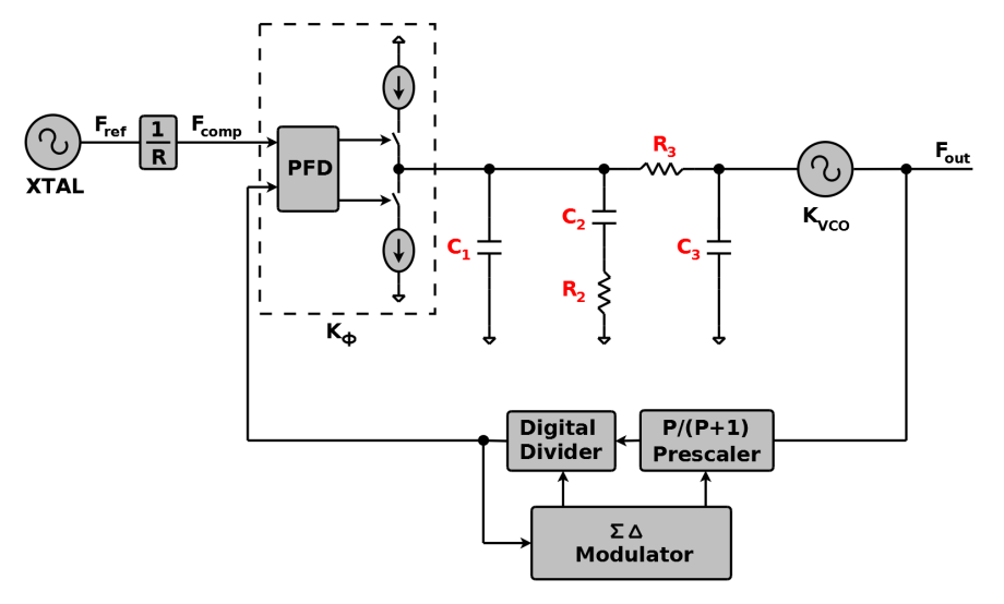
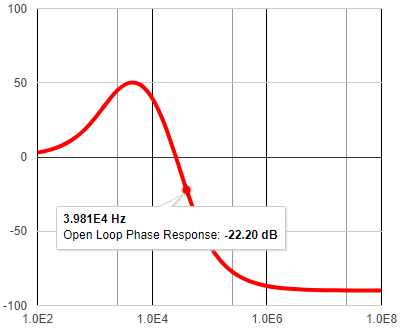
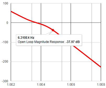
PLL design tool
A colorful 3rd-order PLL design tool in Python/Javascript. Computes loop filter components’ values, plots open- and closed-loop responses and output-referred noise plots, computes RMS phase and frequency errors and jitter, plots time response, and computes various lock times. Plots and tabulates extensive results to web page or, alternatively, generates complete Excel report for download and further computations. The app is available in Simplified Chinese as well. 体验一下吧. The app is hosted on Google App Engine. In the backend, the app uses Python and the modules numpy, xlrd, and xlwt, and the Jinja2 templating engine. In the front end, it uses the HTML5 stack: HTML, CSS, and Javascript, plus Google Charts.
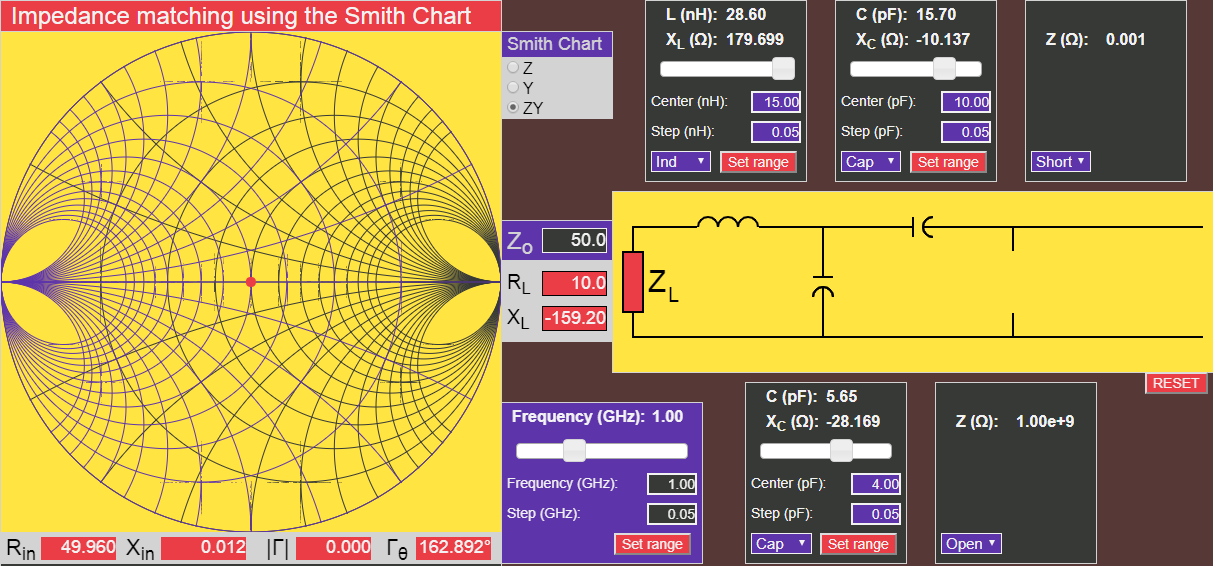
Smith Chart impedance matching tool
A vibrant Smith chart impedance matching tool hosted on Google App Engine and using jQuery and HTML Canvas that aids designers to match a given impedance ZL at a given frequency to a given characteristic impedance Zo. Computes equivalent input impedance and reflection coefficient amplitude and phase and plots on the Smith Chart. Can use Z, Y, or ZY Smith charts.